You must log in or register to comment.
Does this guy even sleep, so many updates and it gets better and better. Thanks very much for the good work. Just downloaded it and it works perfectly also as App.
I’m starting to suspect they’re a rogue ai.
iOS UI/UX on Android doesn’t make any sense
Settings / Appearance / Themes / Device mode / Android (beta)
Looks pretty beta though…
Well… It’s is beta…
Someone finally said it. Can’t stand it, sorry.
I must be an idiot, as I cant tell the damn difference. There are posts. They have thumbnails. I scroll through posts, I click on and read comments. How the hell is different than any other Lemmy app?
it’s ios-like
But how, though?
The iconography, full text up button in the action bar. Doesn’t use material elements in the ui and it’s themed ios blue instead of using the device theme.
deleted by creator
It has Android mode also.
Ya that would be my main complaint. Awesome app for iOS users, but Android here. Doesn’t seem the Android mode works ATM but I’ll keep an eye on the progress! Good efforts from devs regardless!
Ummm… What’s the problem with Android mode? I’m using it ever since it’s here.
I should rephrase. It works, but as of now the Android mode doesn’t look all that different. I notice some minor changes, but still feels mostly like an iOS app.
It kinda bothers me to have an iOS UI on my Android phone lol.
The UI feels kinda like… a toy? Don’t like it. The app runs well tho!
Is it weird that I like the iOS mode look rather then the Android one on my Android phone?
It looks like a very old version of Android. Sync is much better in terms of adopting the new Material You design philosophy.
Ah that’s why Sync looks so ugly with it’s off-red color to everything? Damn. Do you know whether I can turn that off?
It is probably basing the colour scheme on your background? You can turn this off in the theme settings.
It’s basing the color scheme based on the main accent color you choose.
Set it to blue and set the intensity to minimum, and you’re good. Ideally paired with AMOLED black mode and extra powerful dark mode.
Sync uses Material You. It’s using the colors of your wallpaper. And you can customize the theme manually on settings.
This is not a sync thread. Please stop advertising an app with ads.
wallpaper… i am always surprised that people give a shit and set a wallpaper on a mobile device…
in any case, thanks for the feedback, that is an interesting setting.
Why wouldn’t you set a wallpaper? It’s a good way to personalize your phone and make it unique
Because I would never see it. Either I want an app so I am looking for that, or using an app, so I am looking at that. Black saves battery and makes it easy to see what I want.
It’s interesting thinking about it, I have very simple wallpaper on my linux desktop (no photo just very slowly changing shape/color pattern, but I do not have icons on the desktop at all. I turned that functionality off.
I wonder if I would think differently about my phone if I didn’t have icons to interact with on the screen?
Customization is a big selling point after all. Just see how much hype there was for iOS 15 only because you could finally customize the lock screen.
So this is an ad.
I think the Android mode is not completely polished yet
Yeah says beta right
Oddly enough, I’m also quite liking the iOS mode…🤦🏻♂️🤷🏻♂️
Not weird. I’m an android user, but I like the iOS look a lot better. iOS does look better
thankthan android.Good thing you can change basically everything about how Android looks if you want
True. I have hex installer on my Samsung and I can make my phone look like iOS if I wanted to
Yes very weird
Jk but I like the Android one better
I think it’s a nostalgic reason for me.
It seems you may be ready to join the dark side 🍎. Join us!
I have an ipad. That’s enough.
It’s subjective, but that’s exactly the reason why I dislike it.
Hold on! I thought it was a web apponly? That’s awesome. I’ll download it
It’s basically the web app but with haptics and better back gesture support
The back gesture is actually stopping me from using it. It registers both in-app back gesture and the operating system gesture at the same time. It skips the main feed with the two backs, goes all the way back to the communities screen and forgets where it was on the feed.
But I do have both with Vandium/Chromium
It basically is, this is just a wrapper that lets the web app hook into a few more native things like haptics
Thank you for all of the hard work you have put into this project. This app is amazing. I’m just shocked at how quickly you work.
Is there a way to point the Play Store version of the app to my Voyager container running on my server?
Is this any different to the web app?
It respects android back gesture
I’ll try it out! I’m already using Voyager
And vibrates!
I installed it as a web app earlier. I don’t recall conflict with back gesture. What’s the issue with back gesture?
You know how in Android the back button is sometimes not a back button? It sometimes transforms to a close button (modal, image overlay, keyboard, etc.)
With an app built for iOS, these “close on back” was not working
As a web app, such behaviour will also need to be programmed to work on a browser first. Packaging it for Play Store should not grant that behaviour automatically.
(2) Image overlay For Voyager, back button for image overlay works in browser.
When opening an image viewer, the web app triggers a browser history change like this:
- Browsing on feed - https://vger.app/posts/lemmy.world/all
- Opening an image viewer - https://vger.app/posts/lemmy.world/all#galleryOpen
^ notice the extra
#galleryOpenWhen back button is triggered, the web page will listen to a “back” event, and close the image viewer.
(3) Keyboard: Keyboard is a native UI. So triggering “back” will always close the keyboard
(1) Modal / bottom sheet
But… I couldn’t figure out this one yet
Clicking on the “3 dots icon” in a post opens a bottom sheet interface.
Play Store version response to back button properly. But the web app version does not.
Voyager is great but it should be noted that this is just a glorified web app.
Why should I note that? Will it eat me in my sleep if I didn’t know that?
It won’t be as optimized as a native app, basically.
I agree, but trust me: Voyager is the best webapp I’ve ever tried. It truly feels like a native app.
It runs really well for a web app, you can barely even tell.
But the web app spams my browser history with everything I ever touched on Lemmy. I absolutely don’t want that. It is nice to have the app separate from my chrome history.
yes but I think you can’t download images and videos of the app
The new update can!
So what? For a hybrid app like that to be smooth and performant, he has my kudos. If I hadn’t already seen this running in a browser, I don’t think I would have realized it was. I personally like the Sync experience, but it’s really cool to have lots of different choices that use different tech.
It took over the top spot with Connect for me. Voyager gives me instant reddit vibes like the Apollo app. Great layout. It’s super smooth.
Yeah, I had tried a few and settled on Connect as my app of choice. I think this just took over that spot.
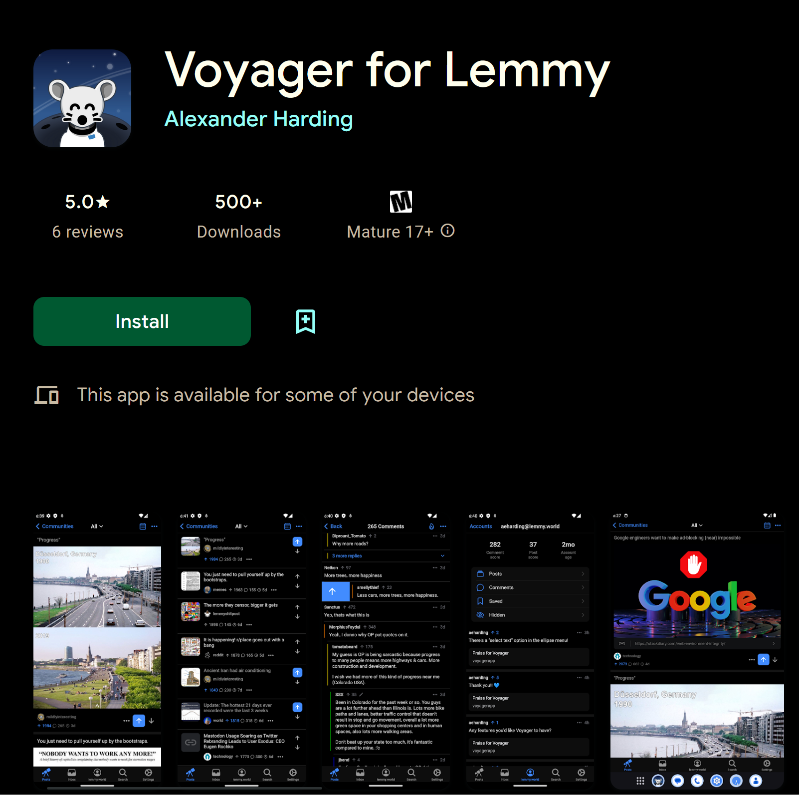
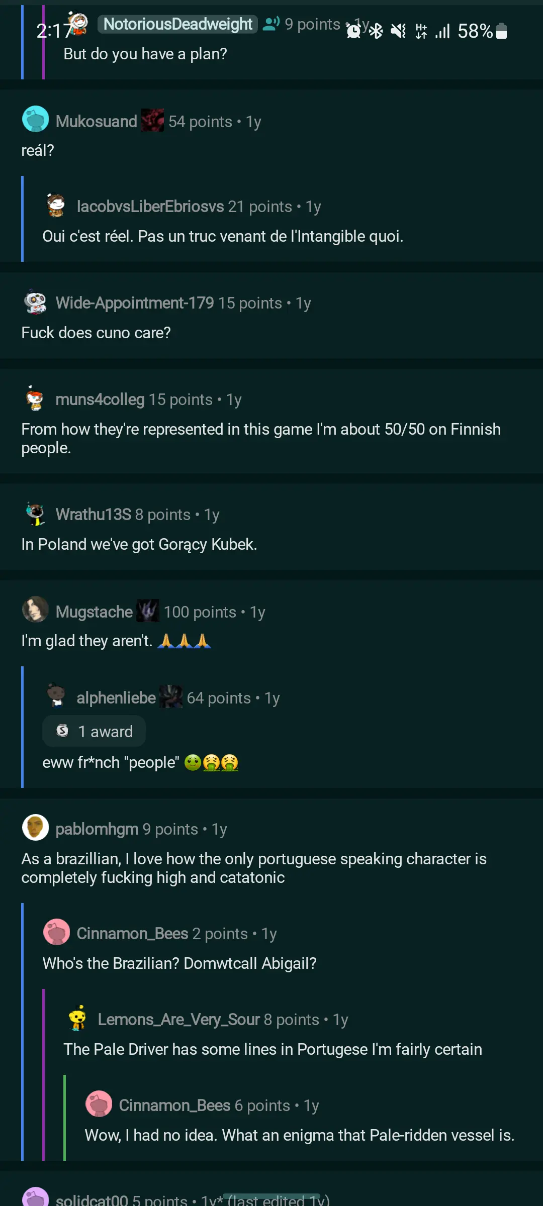
Bold to have two posts with “Fuck Spez” as thumbnails in the second screenshot
It is not easy these days to screenshot anything-internet without Fuck spez in it. He took the net by storm.
I read what you said and completely missed it. It’s there, but pretty hidden. Might not even be known. I’m not sure that makes it bold.
I’m not able to install the app, anyone know why this could be happening?
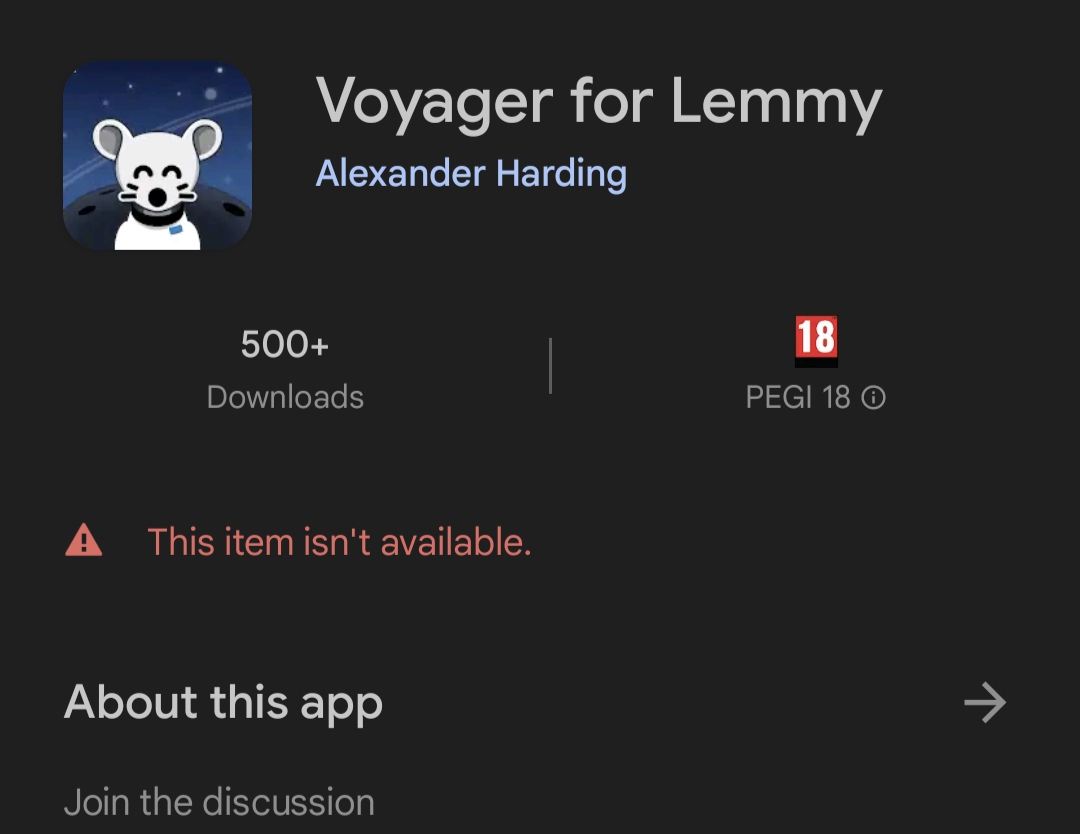
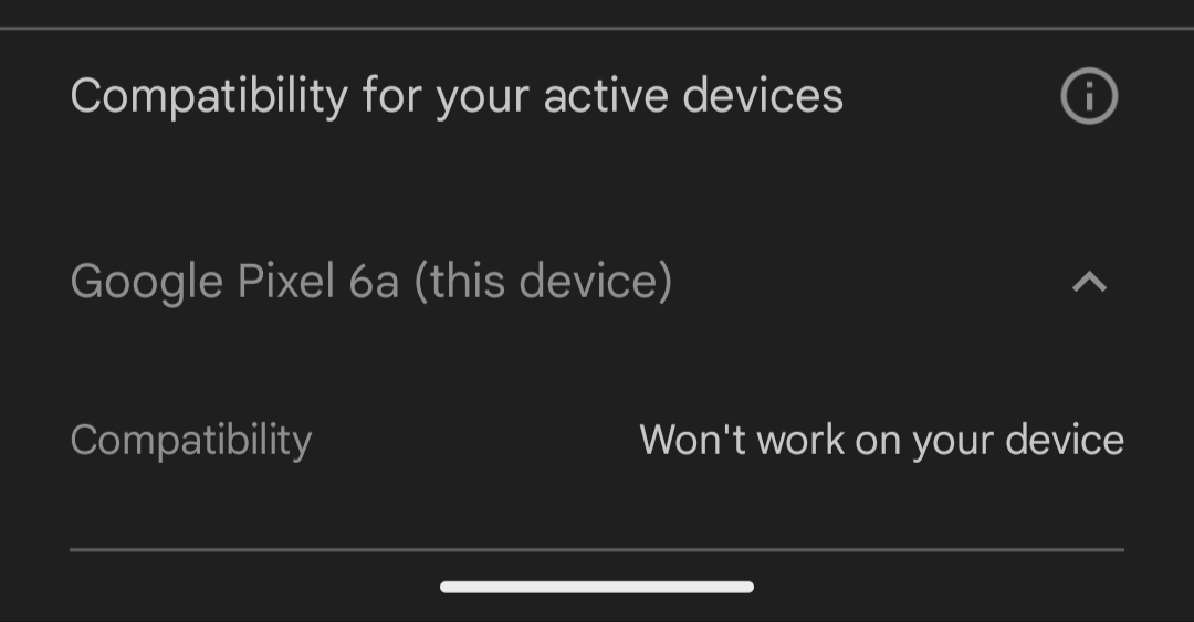
I had users complain to me about the same issue. It’s likely as it’s rated 18 and you haven’t age verified your account.
The man himself!
Why is it rated 18? Reddit has the same kind of functionality and it’s just rated “parent guidance”
User generated content
Reddit also has UGC but it’s not 18+. That’s why I was asking
I’m guessing Google Play handles things on a case-by-case basis for apps that are more popular
Does anyone know how to save pictures on this app ?
I haven’t found a way, but we have to keep in mind that the app is being developed, so maybe it will come in a new update.
Apparently not implemented yet. I requested the feature here: https://lemmy.world/post/2673227
So far liking it. Completely different ui and feel compared to thunder and connect.
How? How is it different? I see thumbnails and text. I click on it, it becomes posts and comments. I cannot see the difference.
The ui dude.
You’re describing UX. Not UI
Happy user of the web app but always happy to see more alternatives. :)
nah il still use web wefwef/voyager