

6·
3 months agoI use it when I’m staying at hotels and want to use their WiFi, or any other public WiFi, to protect my private data. Google probably has it anyway but there’s no need to share it with another unknown entity.
I use it when I’m staying at hotels and want to use their WiFi, or any other public WiFi, to protect my private data. Google probably has it anyway but there’s no need to share it with another unknown entity.
This is a belated April Fool’s joke, right? This looks horrendous. Like the ugly child of iOS and Samsung icons.
I’m still not quite sold on the pill-shaped camera bar but I suppose this design helps with consistency across different types of device (normal phones, foldables, tablets), unlike the current camera visor.
I’m not using two-button navigation but there was one nice thing it did in Android 9: you could flip the pill to the right and hold it to scroll through open apps until you’ve reached the app you wanted to switch to (or move your finger left/right to scroll in that direction), and only then lift the finger.
Unfortunately that only worked in Android 9. In Android 10 you could only swipe to the very next app. Not sure why they butchered that carousel navigation; probably to bring it in line with full gesture navigation.
It’s a relatively new feature that is slowly rolling out to other languages/regions. I received it maybe 2 or 3 weeks ago (in Germany).
I don’t think there’s a definitive list of words/phrases that trigger it. It usually works with one or two words (for example “happy birthday!”) followed by an exclamation mark. Could be pretty much anything. It even works with “Batman!” Although the result is … well, not appropriate for the Dark Knight. 😄

I mean, how many ways can you style an X?
Maybe they need a new mascot now that the bird is gone. How about a hamster? They could call it Xhamster.
Congratulations, you’ve passed Capitalism 101.
Why do they ask for feedback for their platform … on another platform? I don’t have a Twat Twitter account and I don’t intend to ever create one.
It also supports MaterialYou color theming, which always a nice addition to any app.
I remember an interview with Garrett Wang who talked about a conversation with Rick Berman where he asked him whether Kim would ever be promoted to Lieutenant. Berman pretty much shot him down, saying that someone has to be an ensign.
And I think that’s pretty much all the thought that went into it: have characters with a variety of ranks. Possibly to help the audience distinguish them better (“Join me in my ready room, [Rank]”). Although admittedly that didn’t work in the second half of TNG when pretty much everyone (except Worf) was addressed as “Commander” because by season 3(?) everyone was at least a Lieutenant Commander.
With Sisko I think they wanted to distinguish him from the other two Captains Kirk and Picard, and since he commanded “only” a space station that was an in-universe excuse to make Sisko a commander.
Finally. I wonder why that hasn’t already been implemented years ago.
They do that to let search engines index their articles. Then they switch on the paywall an hour later or so but still get a lot of traffic (which is good for advertising) when people click on the link on Google etc.
I’m not digging the back side. The visor looks weird with that large pill cutout. At that point they might as well go back to the full glass visor that the 6/6Pro had.
On the positive side: no curved display, yay!

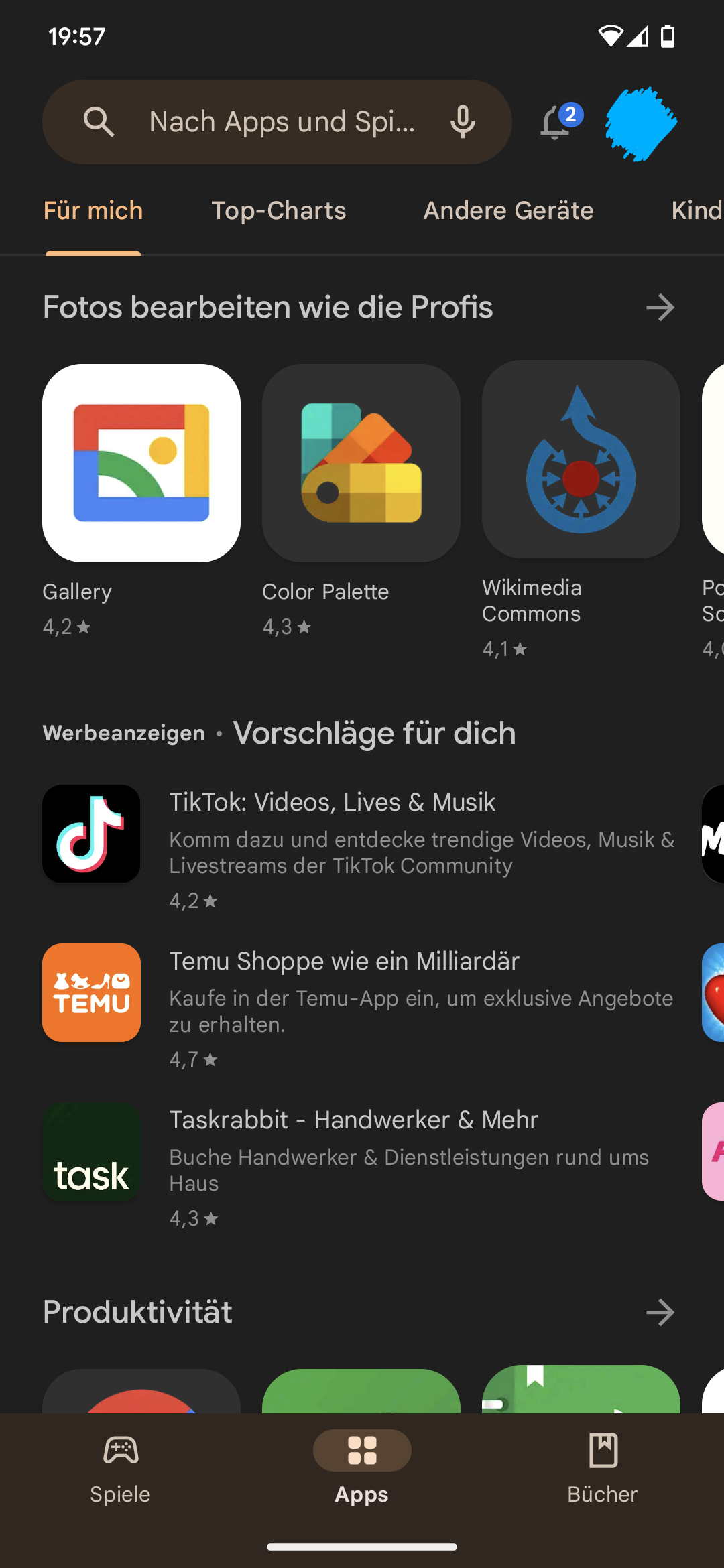
A/B testing. My Play Store was blue for the last couple of weeks, then turned green again a few days ago, and yesterday it was fully MaterialYou-themed (at least on some pages).
Asus has always been big on letting you customize your smartphone, to the point that there are two modes for most changes: “Stock Android” or “Asus Optimized.” These two modes can be chosen from your settings, and when setting up your device, you can choose one or the other. It changes how your notifications look, your volume panel, and your power menu
Tim Schofield shows that in his video at 5:13, and from 7:03 onwards. The Asus Optimized looks more feature-rich but the design is clearly pre-Android-12 and clashes with some of the modern Android design elements. I guess it’s especially for those people who want the old notification drawer design back. 🤷♂️
Material You. I wondered why they wasted resources for … colors. But it’s so nice to have a consistently colored UI across apps and across dark/light modes, and I wished that more apps would support it. Also, those pastel colors are less stressful for the eyes than the previous grey/blue.
I know it’s not everyone’s taste but I really like it.
MVP
Most Valuable Program?
Wouldn’t it be better for our digital wellbeing to have an option that makes it unpleasant to use the phone in bed? 😬